Following on from the posting last year, I’ve kept on generating the same graphs for 2018. Here they are with a small amount of commentary.
Bookmarks
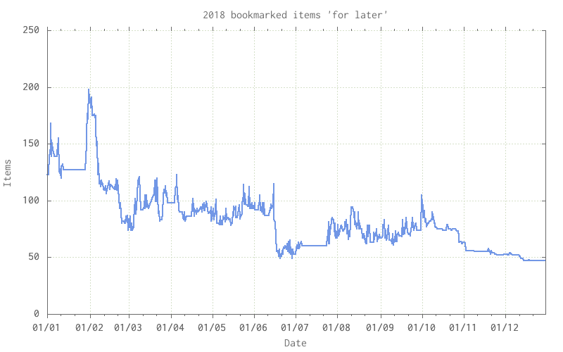
The pile of unread bookmarks:

Stubbornly hovering around 100, there’s a number of items that I must get through some time when I’ve got time and incliniation.
RSS feeds
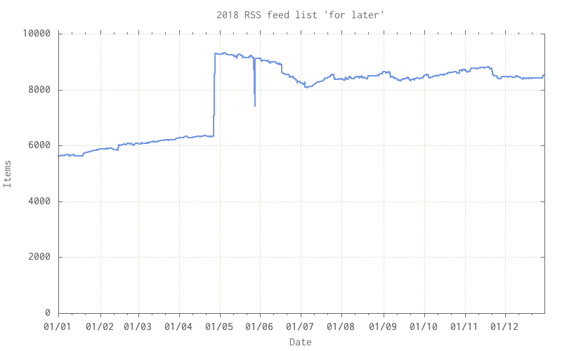
The firehose of RSS entries:

A little too much FOMO and inability to cull. Too often I find an item via my bookmarks above and then decide to add the site’s RSS feed to the mix. The large step up at around was from me adding a feed that included every single page of a blog, not just the 10 or 20 most recent pages! The spike down and back up towards the end of May was a finger fumble that deleted a chunk of the file & was rescued via git(1).
Overall status
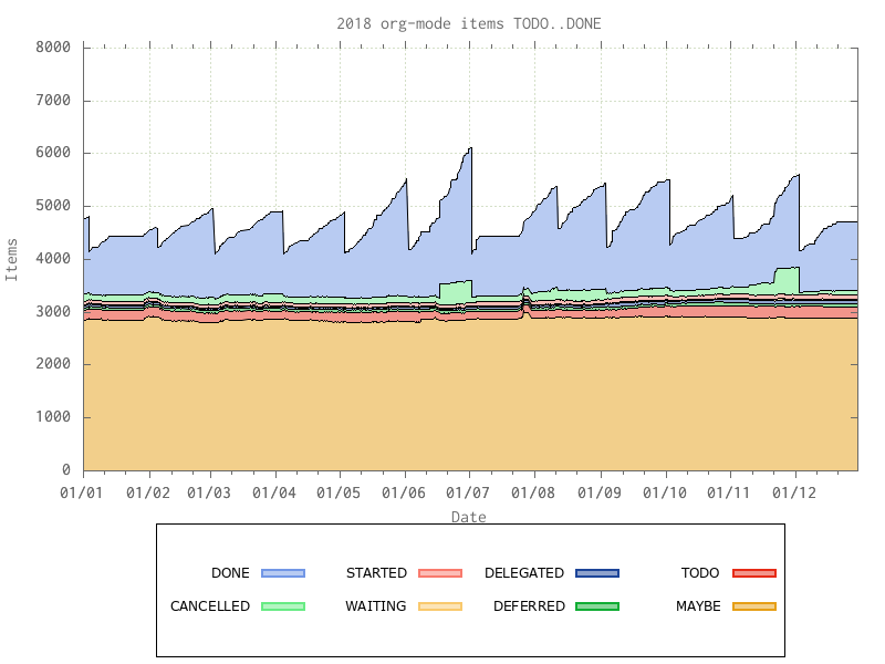
The overall graph of what I’ve got lined up TODO, as well as all the MAYBEs, STARTEDs, DONEs, etc:

The overall sawtooth shape is caused by me archiving off all completed work at the start of each month, the very large number of items in TODO and MAYBE is due to the presence of a number of extensive lists of items – eg a blog’s worth of articles turned into TODO items, or a list of someone’s “100 favourite books” – all present as low priority reading if I find sufficient time and interest.
To improve the appearance of the graph I rearranged the columns; from the completed ones – DONE and CANCELLED – at the top through things underway in various states, down to things definitely TODO and MAYBE todo at the bottom. I’m not sure if I could do that in gnuplot(1), so I brute-forced it by rearranging the columns in the CSV file and the order I collect them in my stats-gathering script.

